
No more boring drawings!

Many drawing tutorials show us how to draw things.
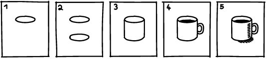
They teach us how to make photo-like drawings. Such renderings look decent but also generic, conventional—like something an AI tool might produce.
And they are also…
boring.
Why is that?
Because they don’t mean anything.
Meaning
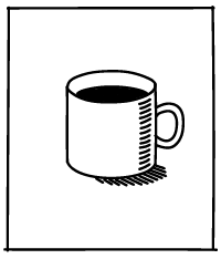
An object, like a cup, can mean many different things to us.
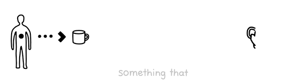
Now the question is: Which meaning is relevant to you right now?
And the answer to this question is what makes your drawing interesting. You just need to show it.
But how?
Composition
We must understand that a drawing is very different from the real thing. For instance, a picture can only show one view. So we have to pick the best view of the object and decide where to it within the bounds of our paper.
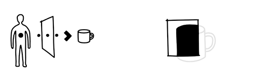
Or in other words: We need to compose the picture.
And this composition will have a drastic impact on how the object appears to us.
Principles
There are no strict rules on how to do this. Instead, artists and designers prefer to speak of principles that can guide our decisions.
Here is a selection of my favourites:
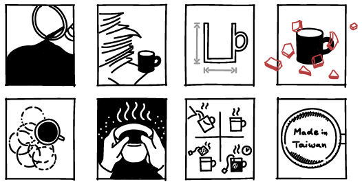
Space
We see the picture plane as an enclosed space with its own rules.
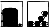
Gravity
These rules are in part shaped by our perceptual habits. For example we impose our experience of physical laws on the shapes we see in a picture. Big shapes at the bottom seem to be “heavy”.
Relation
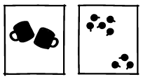
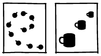
Just as we recognise relationships between things, animals and people in the real world, we see them in visual elements as well.
Chaos & order
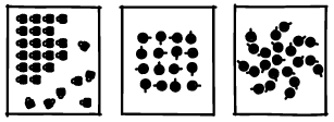
And since we are always searching for rules that structure our surroundings we enjoy regular patterns. They give us a soothing sense of an understandable order.
Contrast
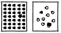
When individual forms stand out from the rest, we notice them first. They seem more important. This is how we can create visible hierarchies.
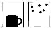
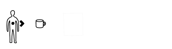
Perspective
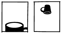
We can also pick a view point in our picture space to suggest a physical relationship to the objects. For example, a thing can appear “bigger than me” or “above me”.
Depth
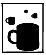
In this way, we can also suggest spatial depth, which implies a sense of time. What is close appears “urgent”, things that are farther away “come later”.
Harmony
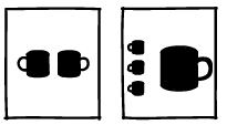
Harmony in a composition suggests that everything is fine. The extreme case is perfect symmetry. Yet we can also position elements of different sizes carefully to retain a sense of balance.
Movement
And finally, linear arrangements can suggest movement and bring static images to life.
Process
We can use these principles to show a particular meaning. However, this requires that we are clear about why we want to draw that thing in the first place.

But even with a clear goal in mind, the workflow to our composition is rarely straightforward. Like many creative processes, image composition can be messy and unpredictable.
Most of the time, we try out many variations to gradually work our way toward a solution.
Every drawing is a self portrait
Of course there are more choices to be made about colour, style or what type of image to create. Yet, I am convinced that composition remains the primary decision. It is the key to intriguing and authentic drawings that show more than just lifeless renderings.
Carefully composed drawings can show our relation to the world.
And that is interesting.
It is interesting because we have made a conscious choice of what is important to us. And chances are that this is also interesting for others.
So to bring your drawings to the next level—after learning how to draw something—is to show why you draw it. And then, perhaps your drawing makes us see something in a new way: your way.
I've always enjoyed your very succinct drawings which say so much so simply and clearly.
I always learn something from these posts, so thank you for putting in time to do them Ralph.
I learned more about artistic expression in the last 10 minutes than at any other time in my life. So well done!